Imperator Organic Winery
Through Wine to the Stars
Client
Imperator Oragnic Winery
Sector
Dining & Beverage,
Retail,
Disciplines
Branding,
Strategy,
Packaging,
Digital,
Brand Architecture,
Literature & Print,
Naming,
Brand Engagement,
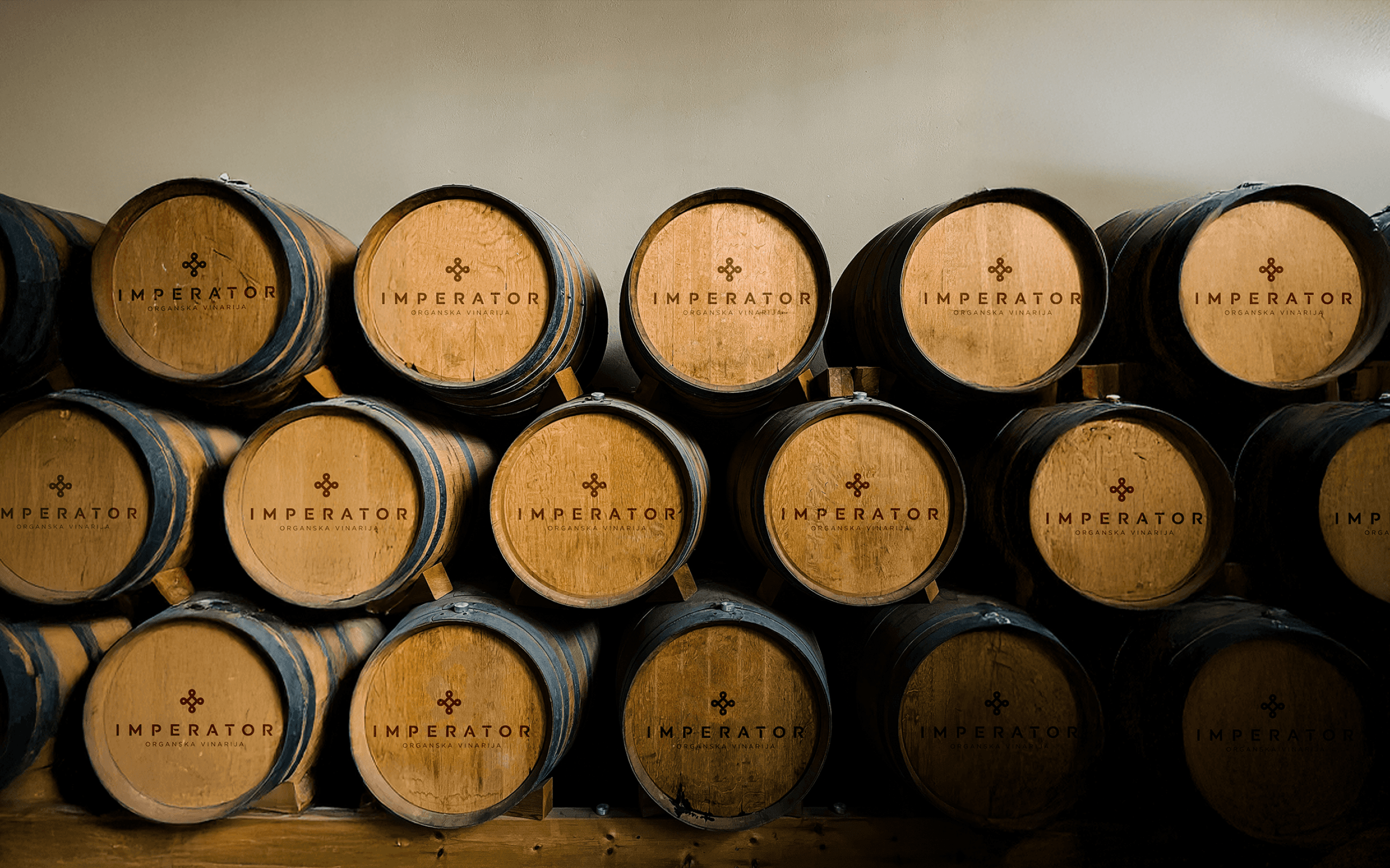
Imperator has established itself as a pioneer in Serbia's emerging wine market since 2009, producing high-quality organic wines using biodynamic practices. As the quality and ambition of the wines evolved, the existing visual identity no longer reflected the maturity of the work in the vineyard or the values behind the process. The winery needed a contemporary brand system that could express craft and conviction while honouring their respect for nature, balance, and the rich viticultural heritage of the Fruška Gora region. Working closely with the founders, we developed a new brand identity that translates Imperator’s philosophy into a clear and disciplined visual language, bringing structure and clarity to the portfolio while preserving the warmth and authenticity of the winery.
Imperator Organic Winery
Through Wine to the Stars
Client
Imperator Oragnic Winery
Sector
Dining & Beverage,
Retail,
Disciplines
Branding,
Strategy,
Packaging,
Digital,
Brand Architecture,
Literature & Print,
Naming,
Brand Engagement,
Imperator has established itself as a pioneer in Serbia's emerging wine market since 2009, producing high-quality organic wines using biodynamic practices. As the quality and ambition of the wines evolved, the existing visual identity no longer reflected the maturity of the work in the vineyard or the values behind the process. The winery needed a contemporary brand system that could express craft and conviction while honouring their respect for nature, balance, and the rich viticultural heritage of the Fruška Gora region.
Working closely with the founders, we developed a new brand identity that translates Imperator’s philosophy into a clear and disciplined visual language, bringing structure and clarity to the portfolio while preserving the warmth and authenticity of the winery.
The brand positioning Per Vinum ad Astra (through wine to the stars) captures Imperator’s long term ambition. Adapted from the classical phrase Per Aspera ad Astra, it reframes elevation as the result of care, time, and belief in the process, speaking to a philosophy where excellence is cultivated through time and experience.
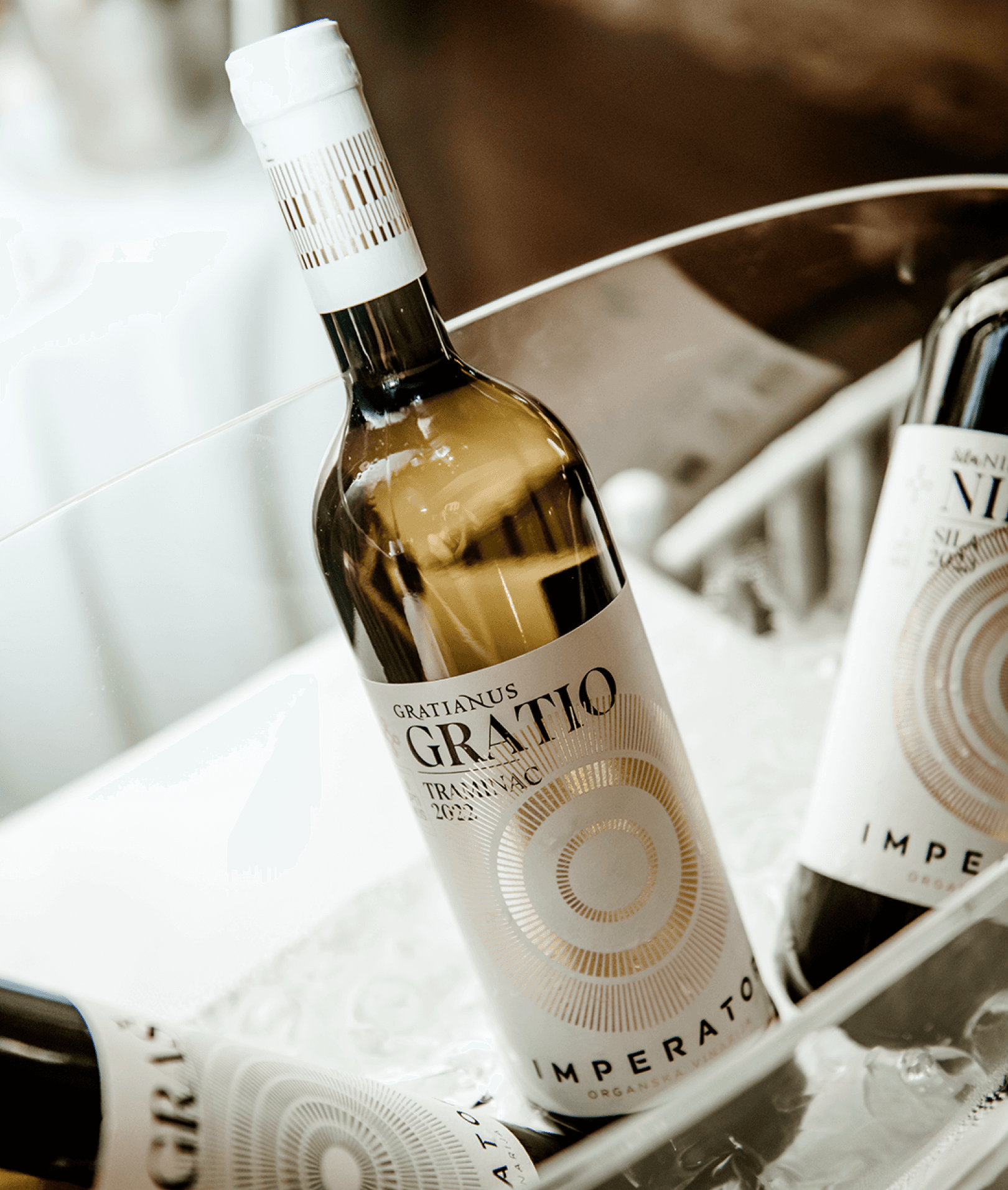
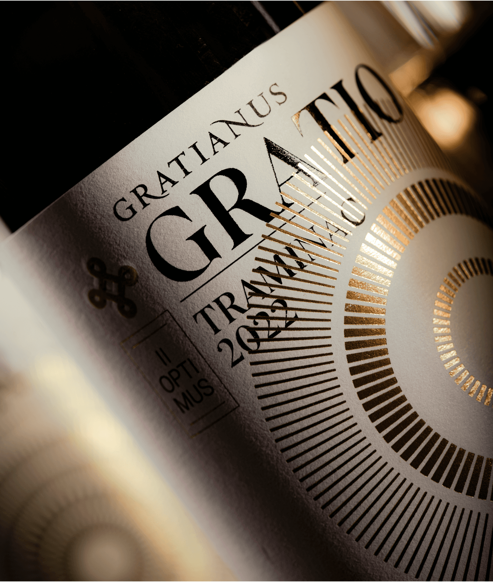
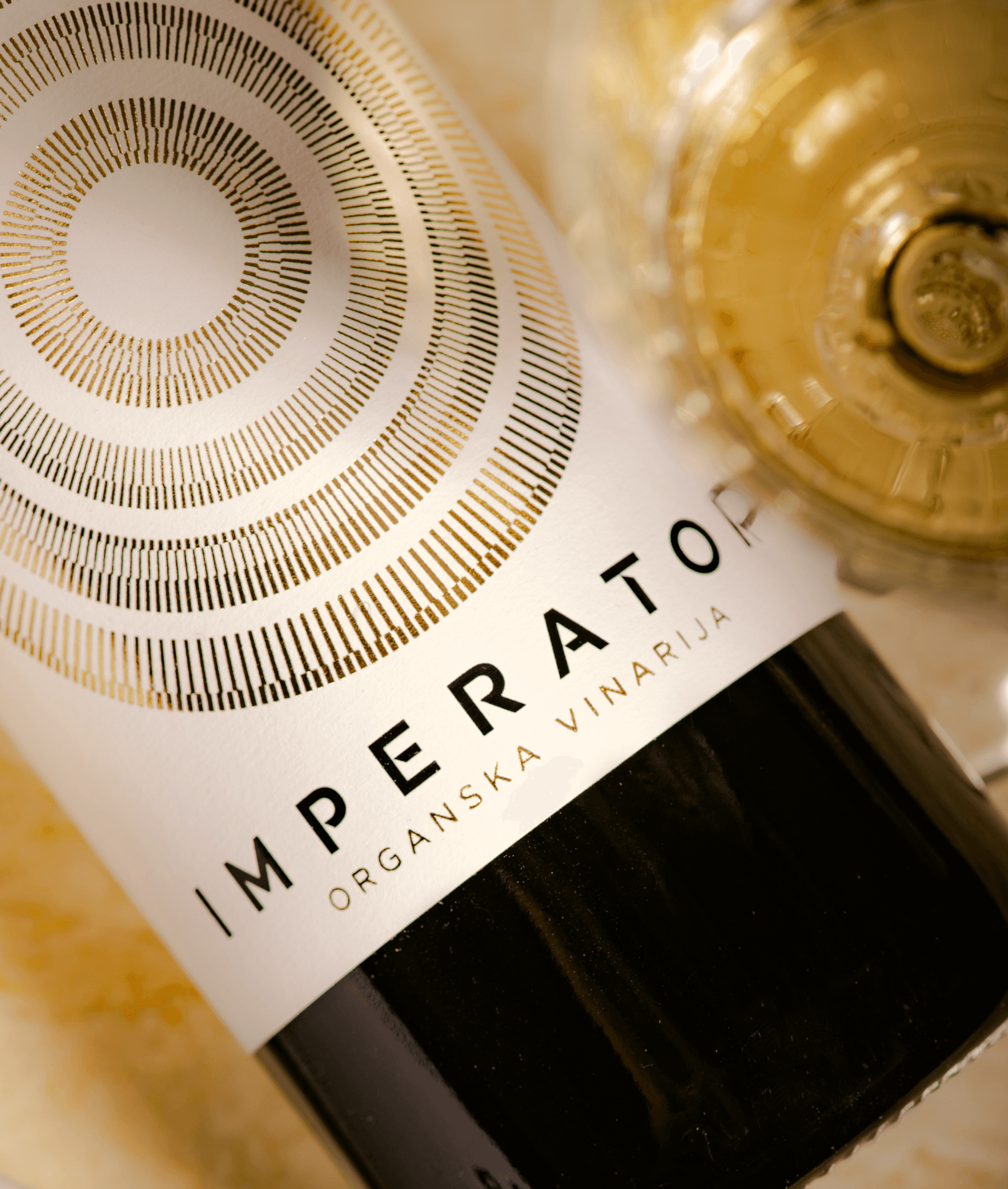
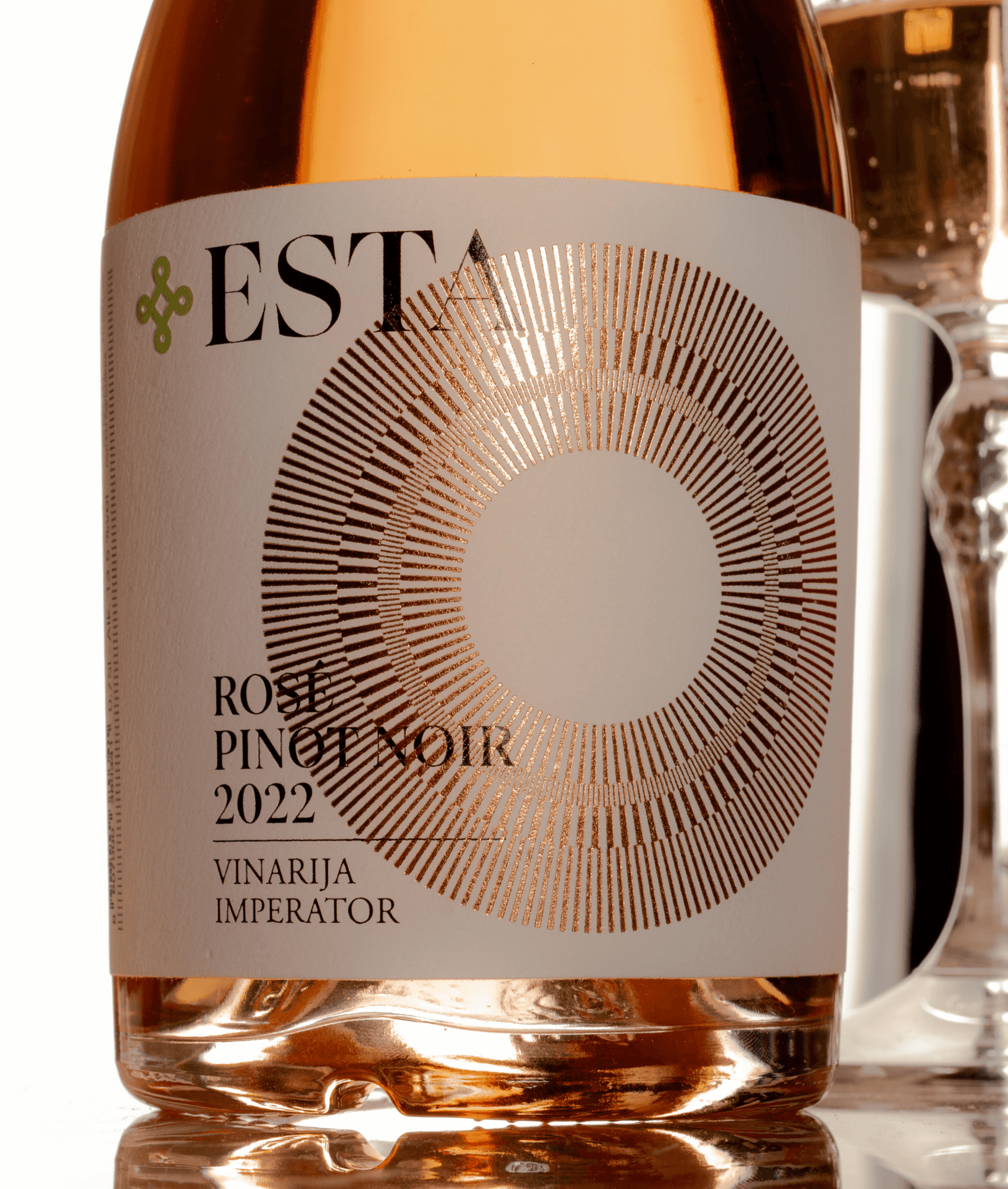
The form draws from classical Roman geometry and the fundamental elements of winemaking: air, sun, water, and soil with wine at the centre. The intersecting circular forms express convergence and balance, reflecting the belief that great wine is created through harmony, not control.
The brand positioning Per Vinum ad Astra (through wine to the stars) captures Imperator’s long term ambition. Adapted from the classical phrase Per Aspera ad Astra, it reframes elevation as the result of care, time, and belief in the process, speaking to a philosophy where excellence is cultivated through time and experience.
The form draws from classical Roman geometry and the fundamental elements of winemaking: air, sun, water, and soil with wine at the centre. The intersecting circular forms express convergence and balance, reflecting the belief that great wine is created through harmony, not control.
Supporting the symbol is a linear graphic system inspired by vineyard stakes, a familiar and functional object in viticulture. Abstracted into refined geometric lines, the system introduces rhythm and variation across the brand.
Supporting the symbol is a linear graphic system inspired by vineyard stakes, a familiar and functional object in viticulture. Abstracted into refined geometric lines, the system introduces rhythm and variation across the brand.
Subtle shifts in pattern and line density distinguish the three wine tiers Primus, Optimus, and Maximus, creating an elegant visual hierarchy that distinguishes each level of wine. The system creates hierarchy without breaking the unity of the brand.
Subtle shifts in pattern and line density distinguish the three wine tiers Primus, Optimus, and Maximus, creating an elegant visual hierarchy that distinguishes each level of wine. The system creates hierarchy without breaking the unity of the brand.