EXPO 2027 Belgrade
Play for Humanity
Client
EXPO 2027 Belgrade
Sector
Arts & Culture,
Disciplines
Branding,
Literature & Print,
Signage & Wayfinding,
Packaging,
Brand Architecture,
Digital,
Brand Engagement,
Brand Environment,
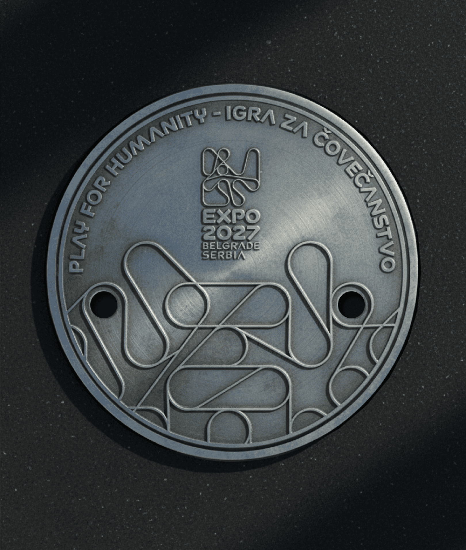
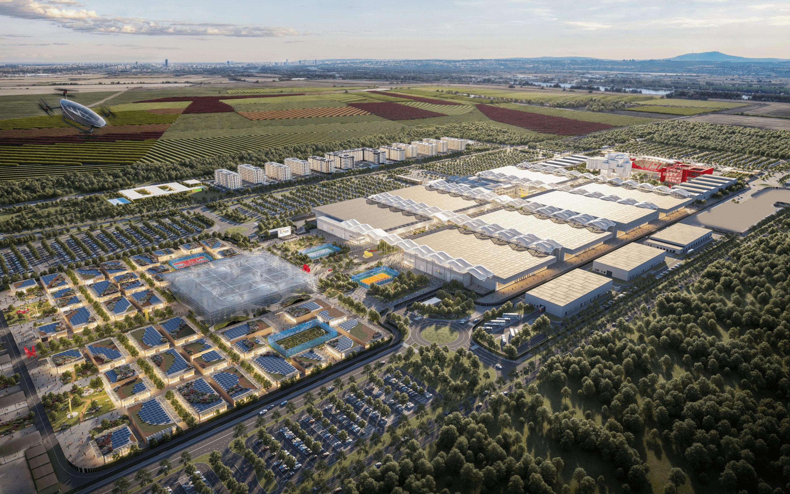
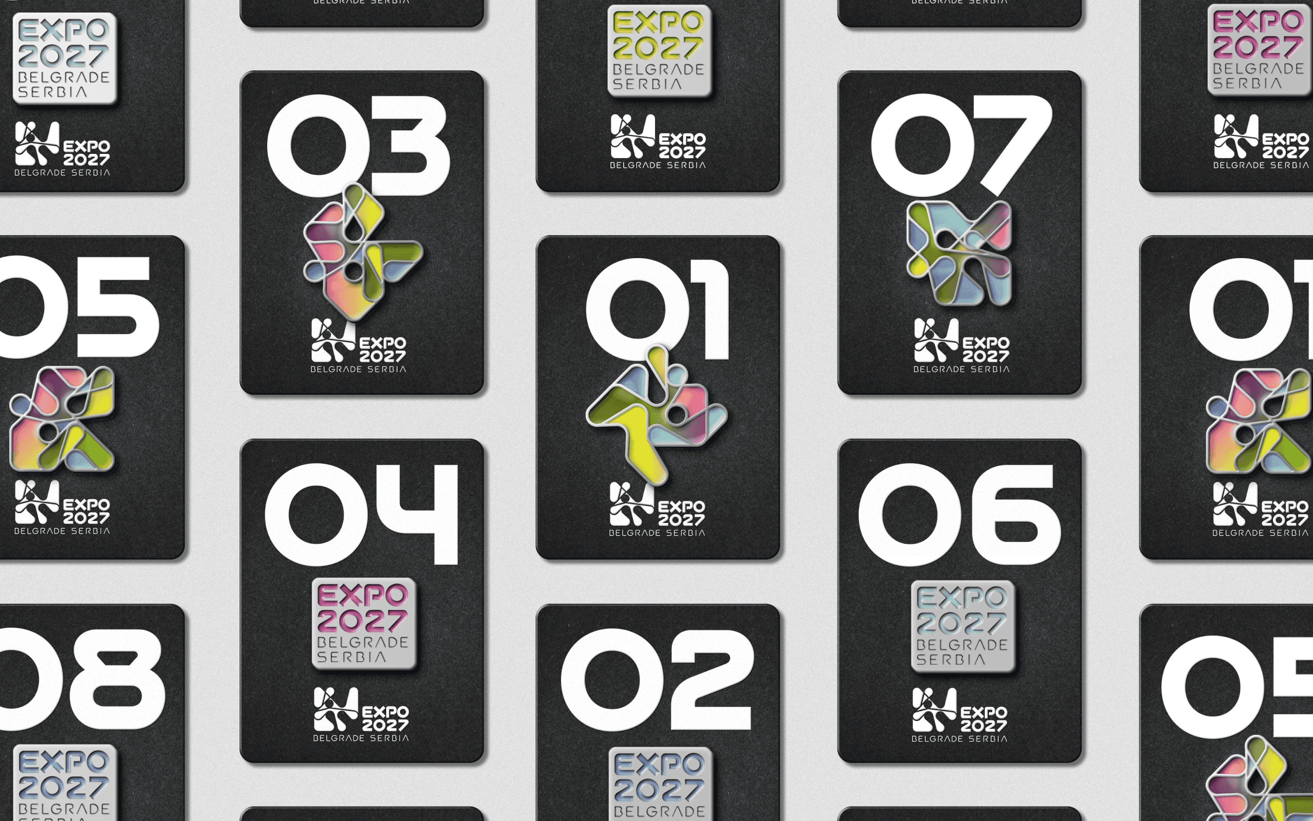
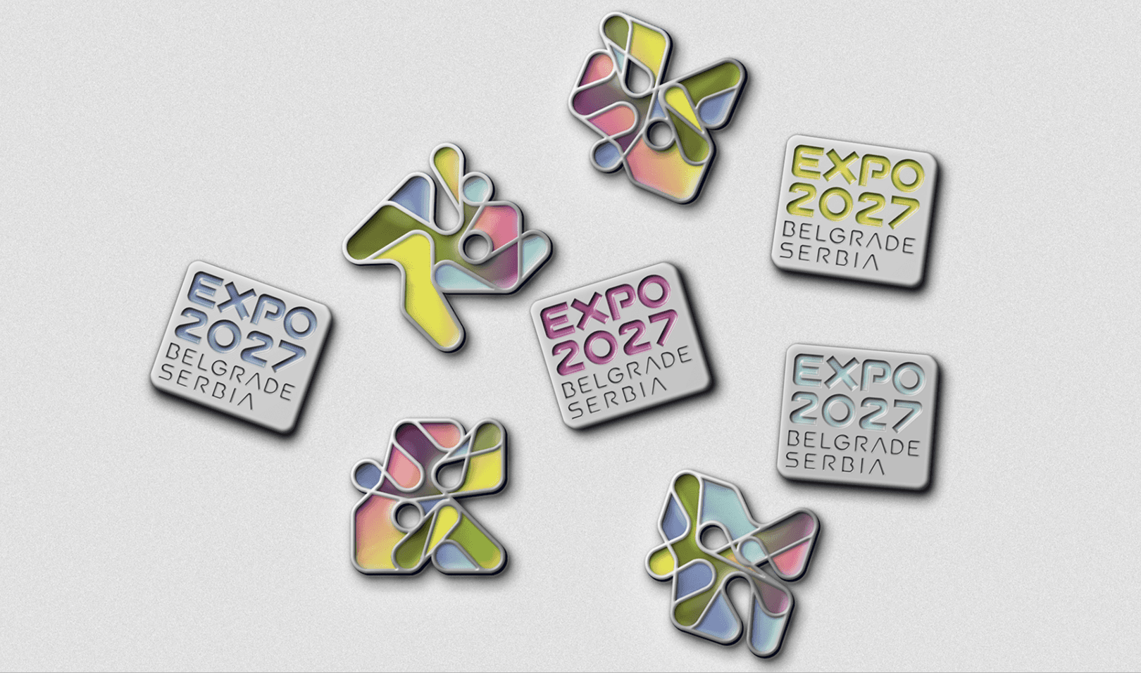
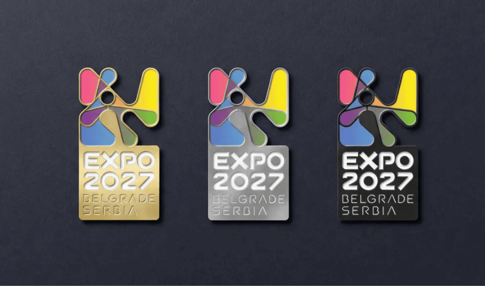
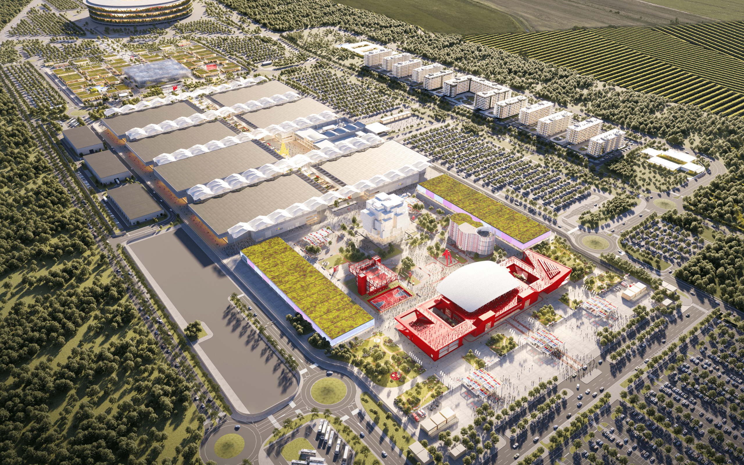
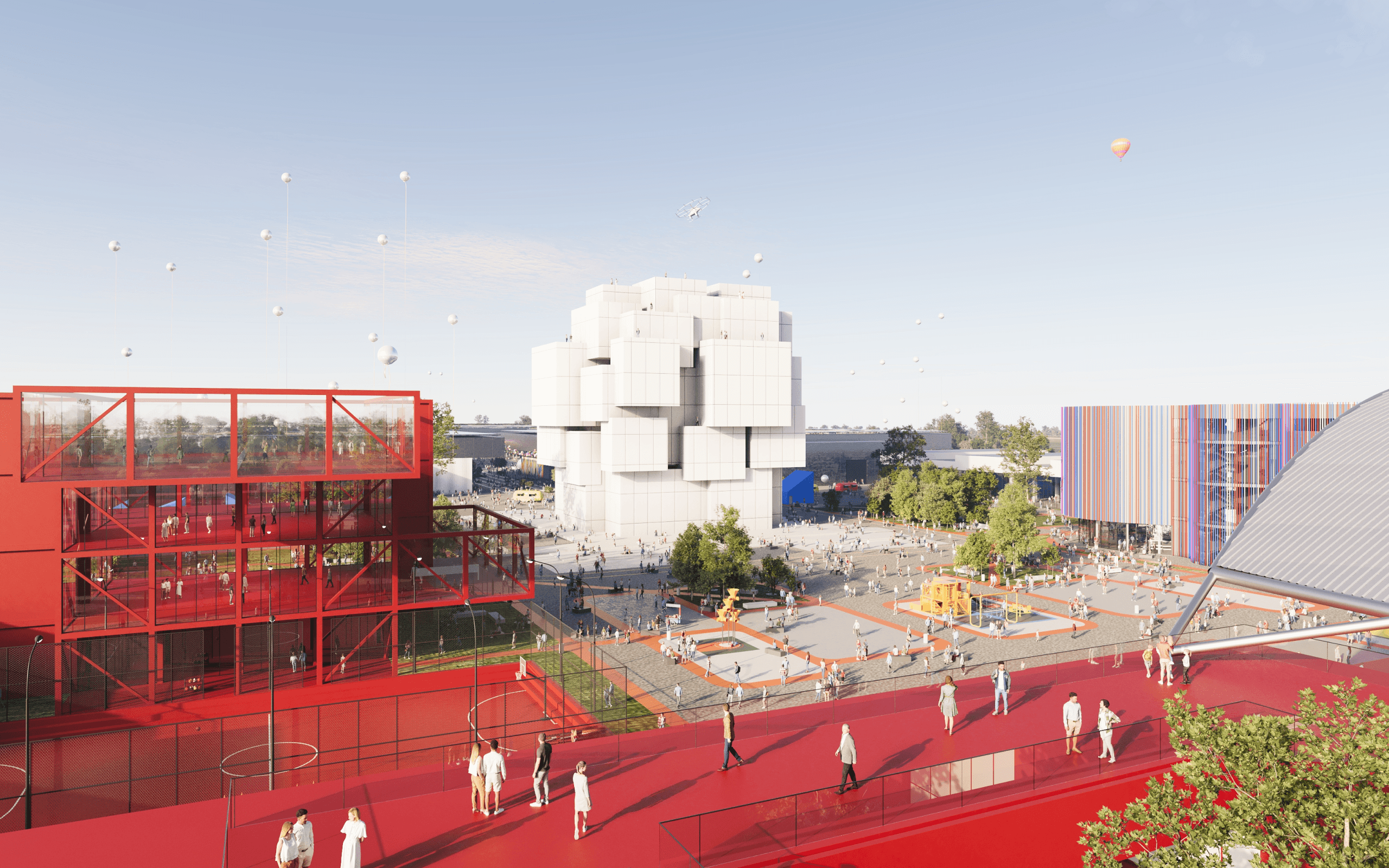
EXPO 2027 Belgrade is the first Specialised Expo to be held in the Western Balkans — an internationally recognised event bringing more than 130 participating countries and an expected 4 million visitors to a purpose-built 25-hectare site over a 93-day programme. Working from the theme Play for Humanity: Sport and Music for All, we developed a comprehensive visual language built around excitement and motion — lively enough to feel human, structured enough to hold together across an exposition of this size. This identity is also built to work everywhere, from a building façade to a brochure to a golden pin, for an international audience that would encounter it in dozens of languages and contexts at once.
EXPO 2027 Belgrade
Play for Humanity
Client
EXPO 2027 Belgrade
Sector
Arts & Culture,
Disciplines
Branding,
Literature & Print,
Signage & Wayfinding,
Packaging,
Brand Architecture,
Digital,
Brand Engagement,
Brand Environment,
EXPO 2027 Belgrade is the first Specialised Expo to be held in the Western Balkans — an internationally recognised event bringing more than 130 participating countries and an expected 4 million visitors to a purpose-built 25-hectare site over a 93-day programme. Working from the theme Play for Humanity: Sport and Music for All, we developed a comprehensive visual language built around excitement and motion — lively enough to feel human, structured enough to hold together across an exposition of this size. This identity is also built to work everywhere, from a building façade to a brochure to a golden pin, for an international audience that would encounter it in dozens of languages and contexts at once.
EXPO 2027 Belgrade is the first Specialised Expo to be held in the Western Balkans — an internationally recognised event bringing more than 130 participating countries and an expected 4 million visitors to a purpose-built 25-hectare site over a 93-day programme. Working from the theme Play for Humanity: Sport and Music for All, we developed a comprehensive visual language built around excitement and motion — lively enough to feel human, structured enough to hold together across an exposition of this size. This identity is also built to work everywhere, from a building façade to a brochure to a golden pin, for an international audience that would encounter it in dozens of languages and contexts at once.
EXPO 2027 Belgrade is the first Specialised Expo to be held in the Western Balkans — an internationally recognised event bringing more than 130 participating countries and an expected 4 million visitors to a purpose-built 25-hectare site over a 93-day programme. Working from the theme Play for Humanity: Sport and Music for All, we developed a comprehensive visual language built around excitement and motion — lively enough to feel human, structured enough to hold together across an exposition of this size. This identity is also built to work everywhere, from a building façade to a brochure to a golden pin, for an international audience that would encounter it in dozens of languages and contexts at once.


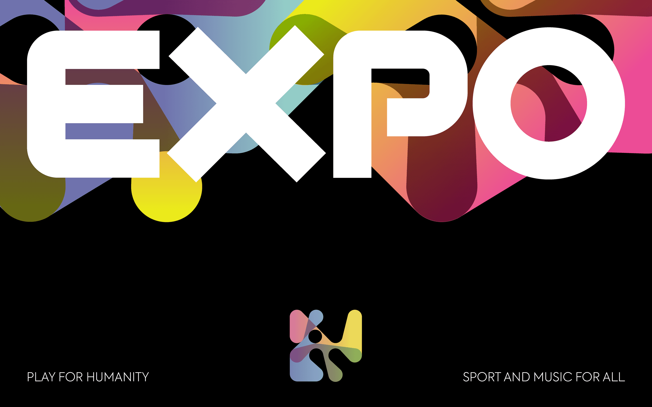
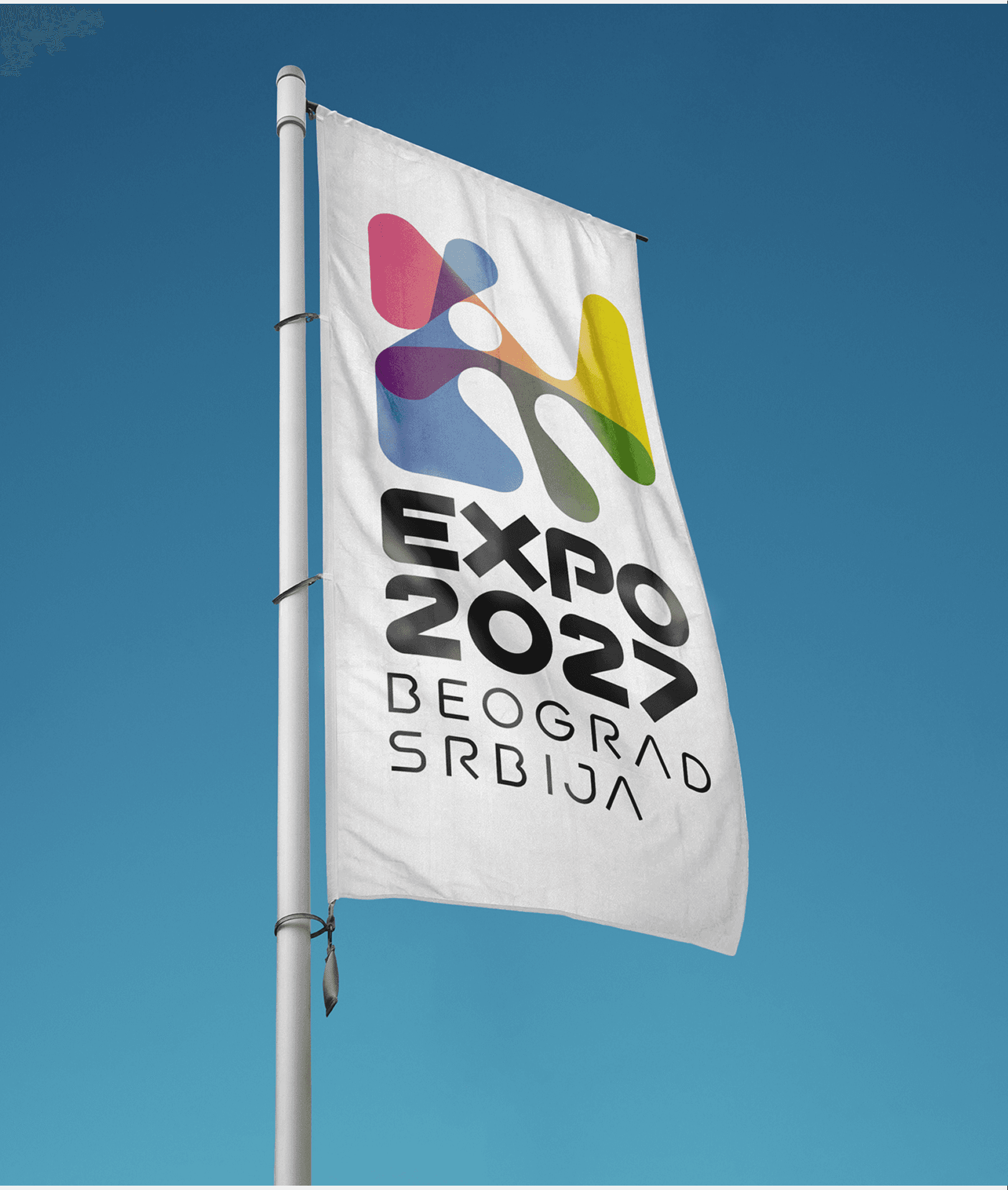
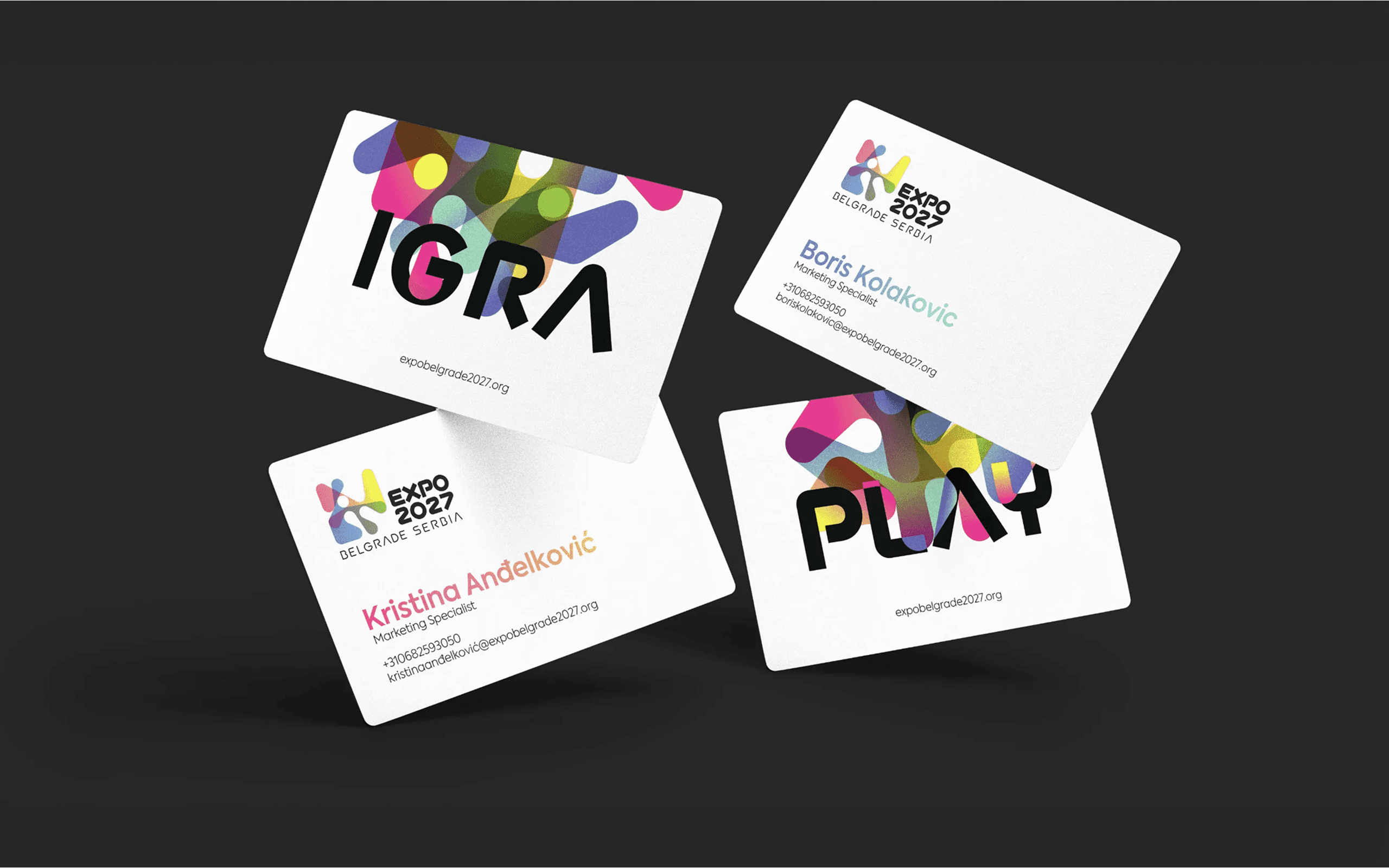
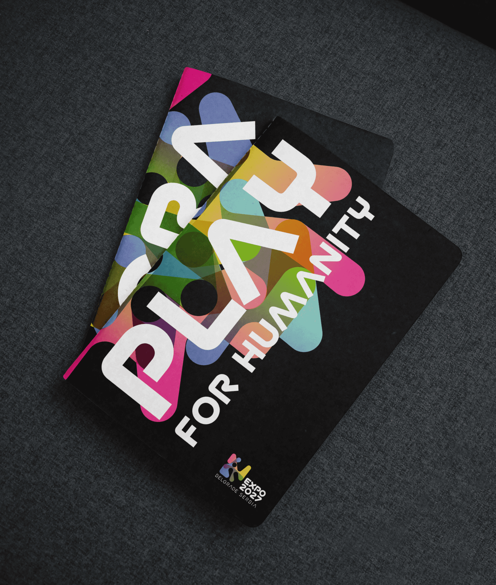
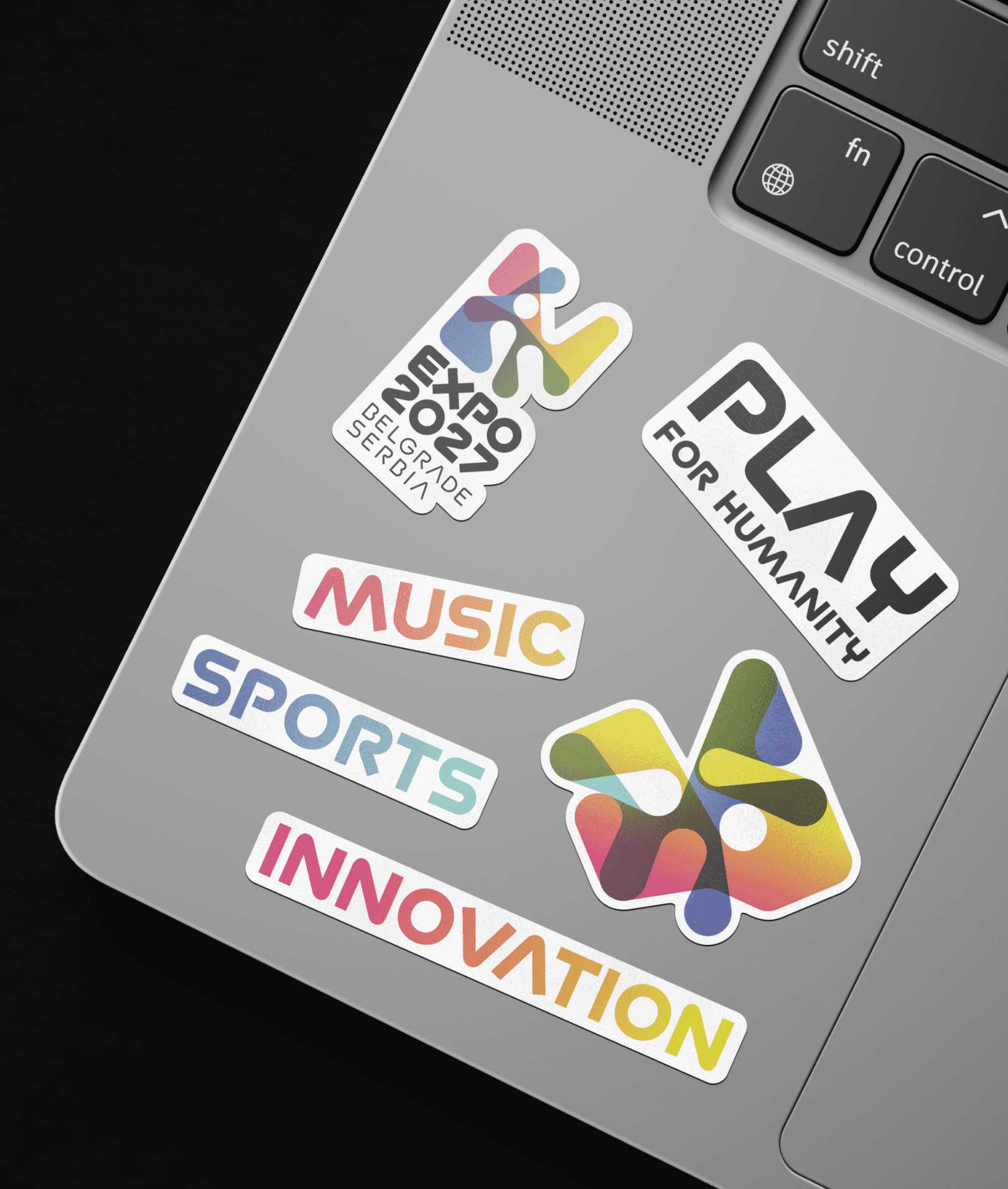
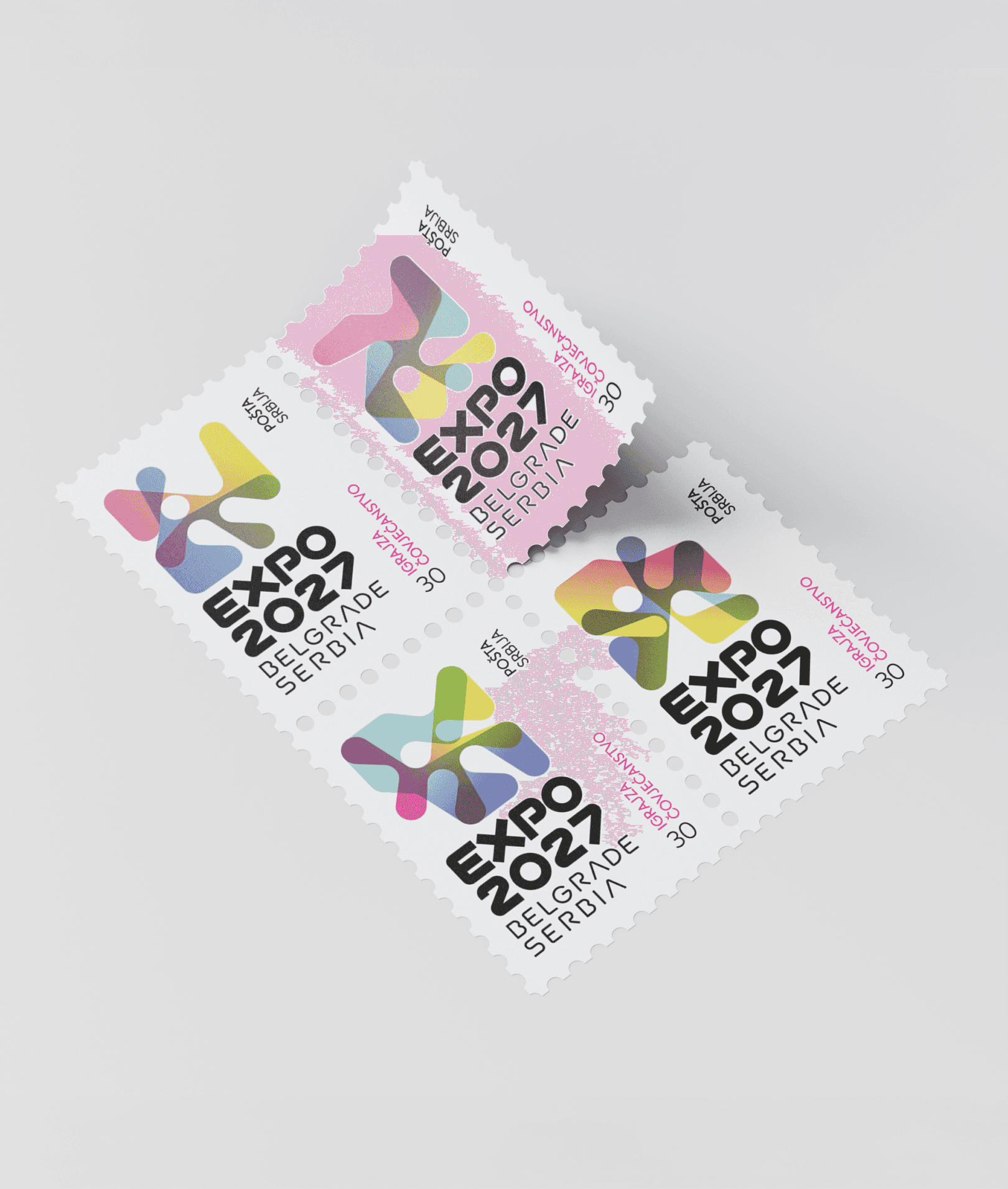
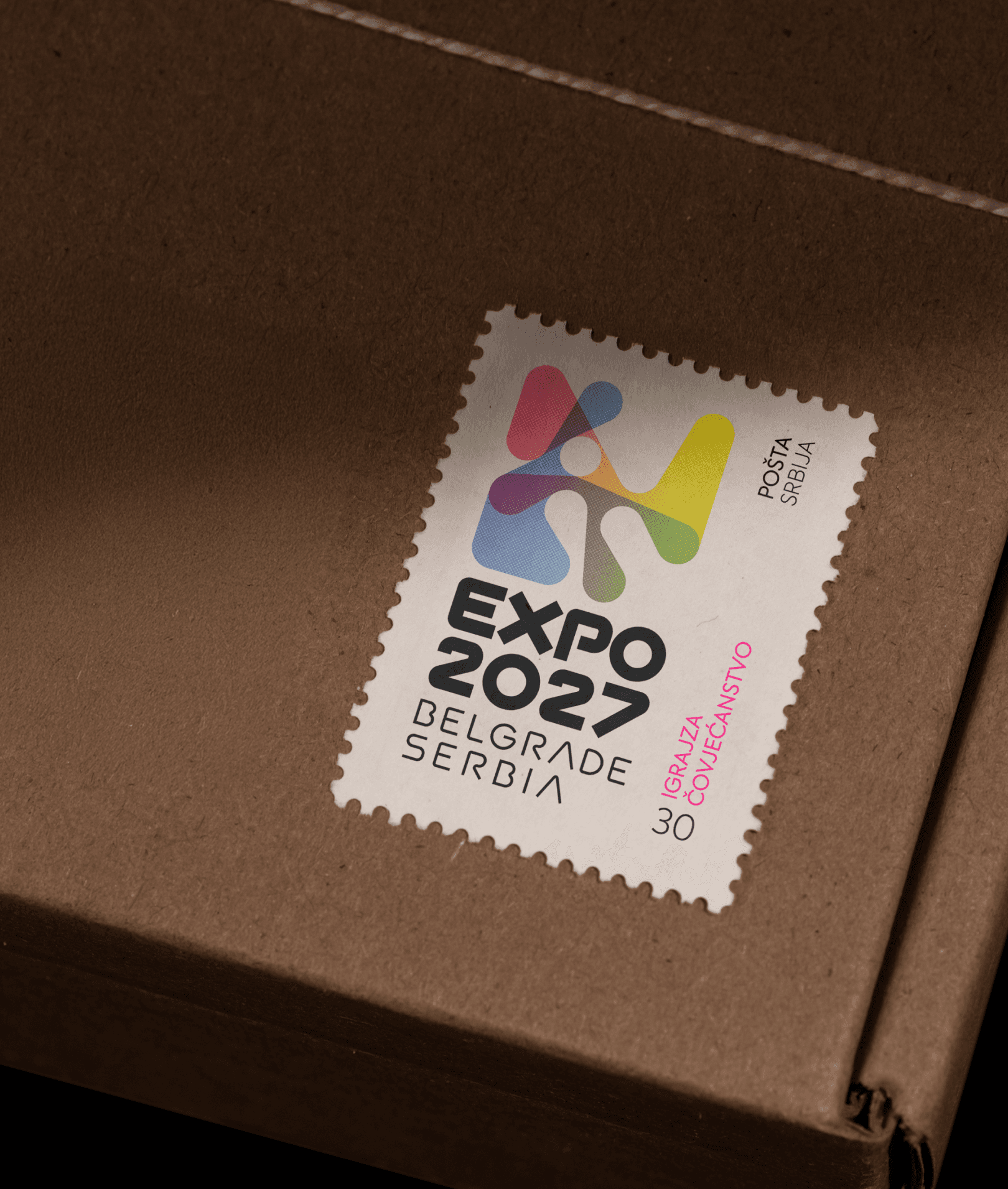
The identity is built on two ideas held together. The first is a sense of place: the mark is drawn from the point where Belgrade's two rivers, the Sava and the Danube, meet - two currents converging into one. The second message is the theme itself: Play for Humanity, expressed through playful, dynamic forms and colour. Together they produce a mark of transparent, overlapping shapes that shift and layer like water: never the same yet regular, carrying a sense of movement that holds even when it's standing still.
The identity is built on two ideas held together. The first is a sense of place: the mark is drawn from the point where Belgrade's two rivers, the Sava and the Danube, meet - two currents converging into one. The second message is the theme itself: Play for Humanity, expressed through playful, dynamic forms and colour. Together they produce a mark of transparent, overlapping shapes that shift and layer like water: never the same yet regular, carrying a sense of movement that holds even when it's standing still.
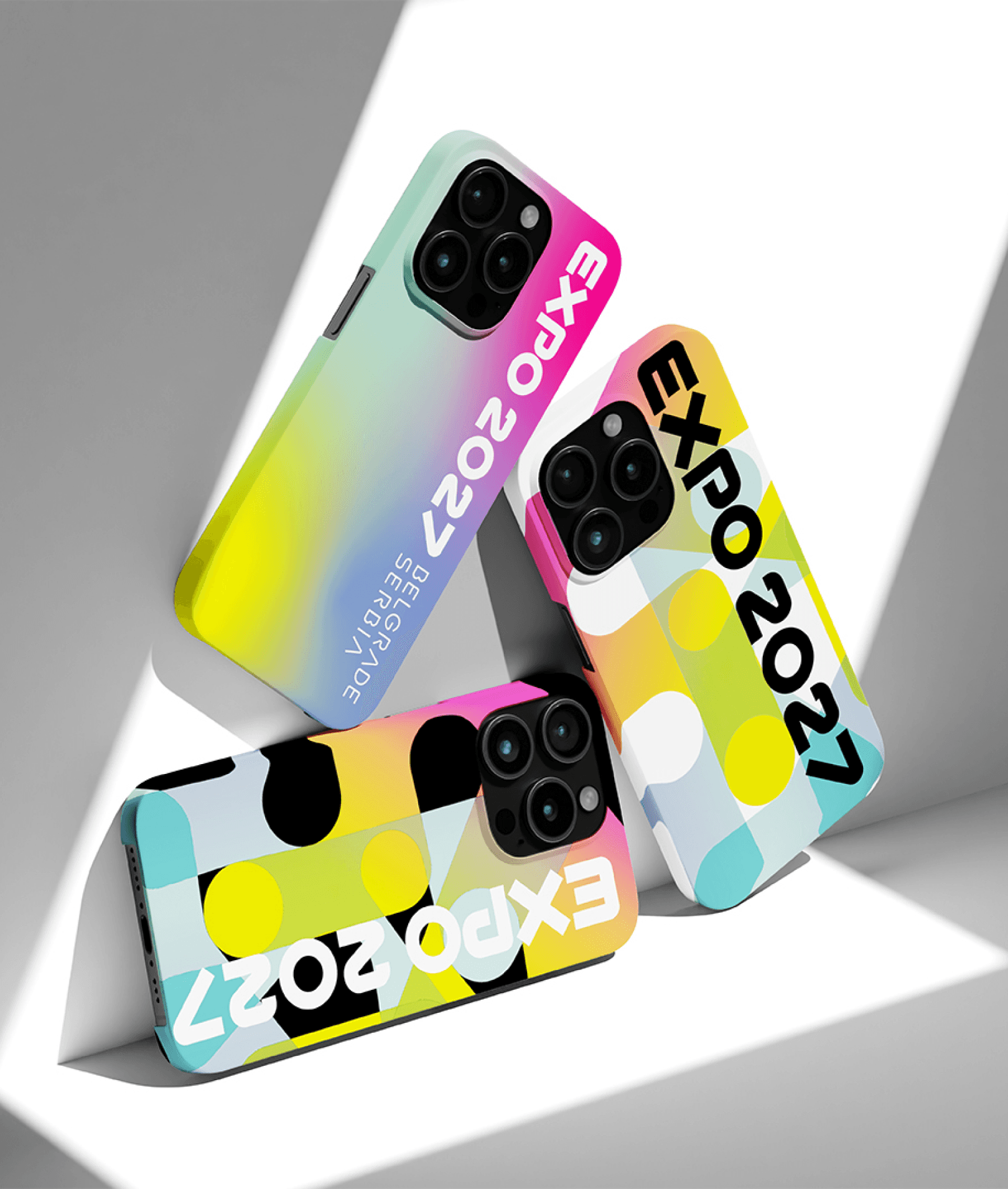
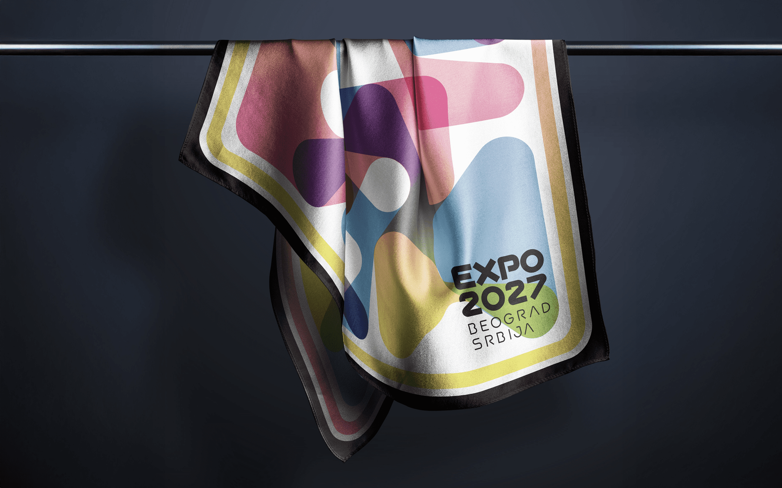
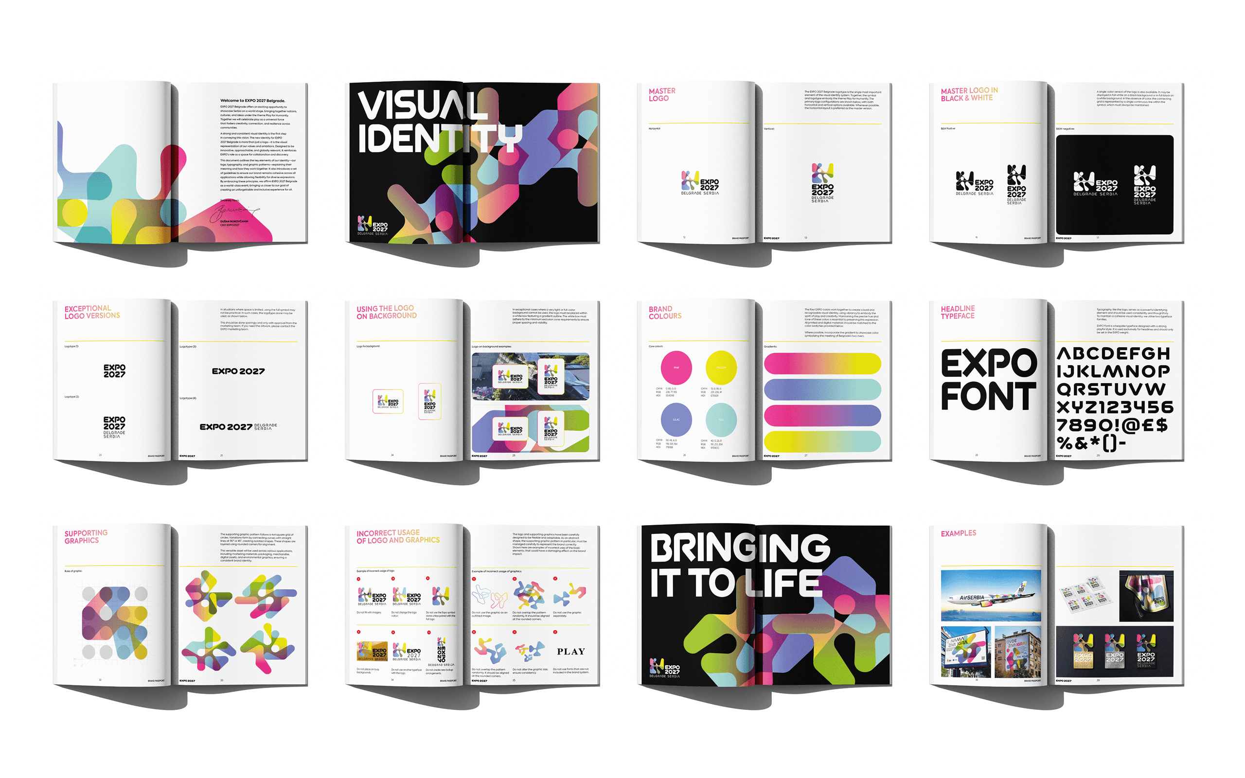
The colour system mirrors the dual-river concept with two distinct palettes. Vibrant gradients and bold hues convey energy and playfulness, while transparency allows colours to blend and shift, reinforcing the themes of fluidity and interaction central to the brand.
The colour system mirrors the dual-river concept with two distinct palettes. Vibrant gradients and bold hues convey energy and playfulness, while transparency allows colours to blend and shift, reinforcing the themes of fluidity and interaction central to the brand.
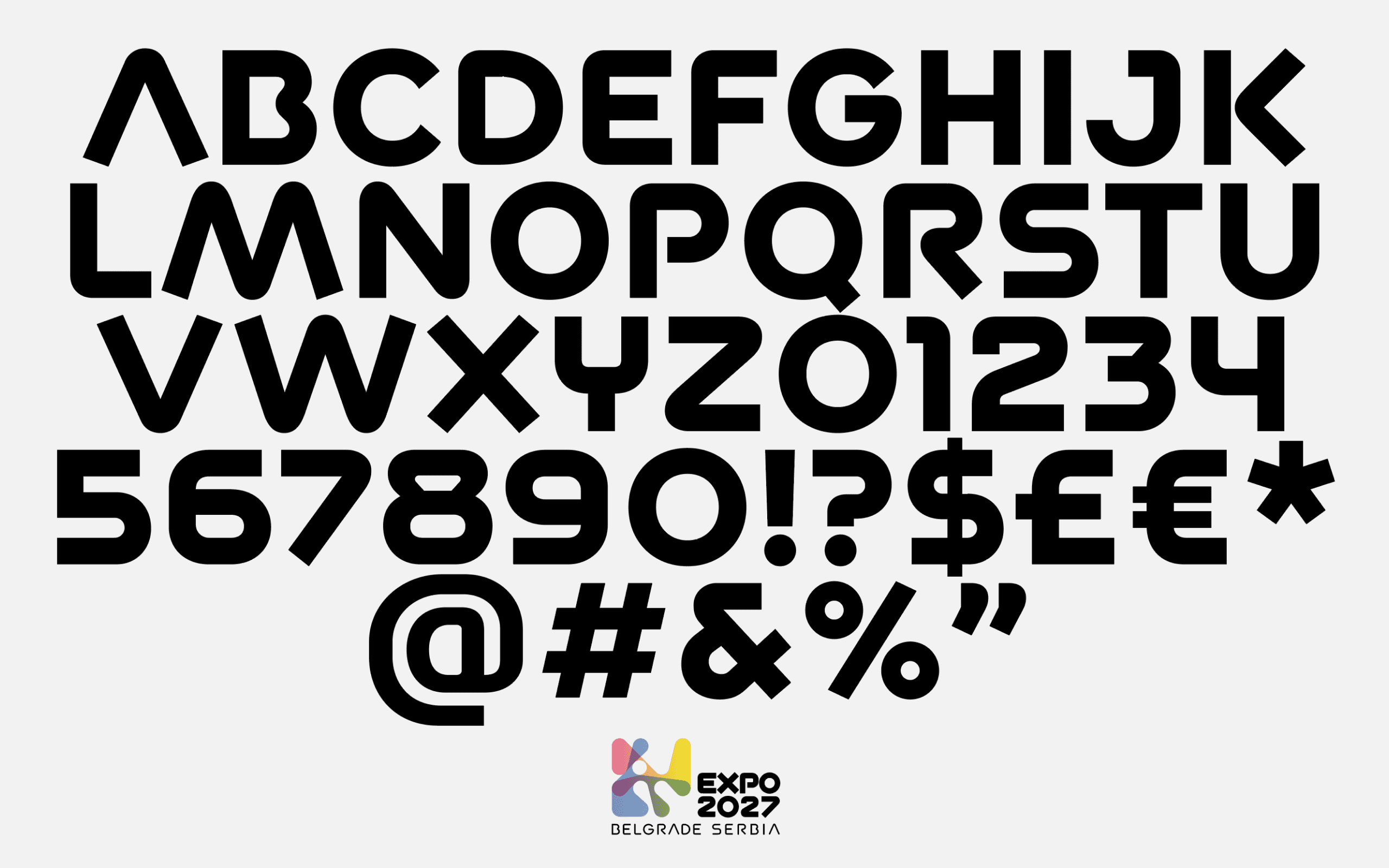
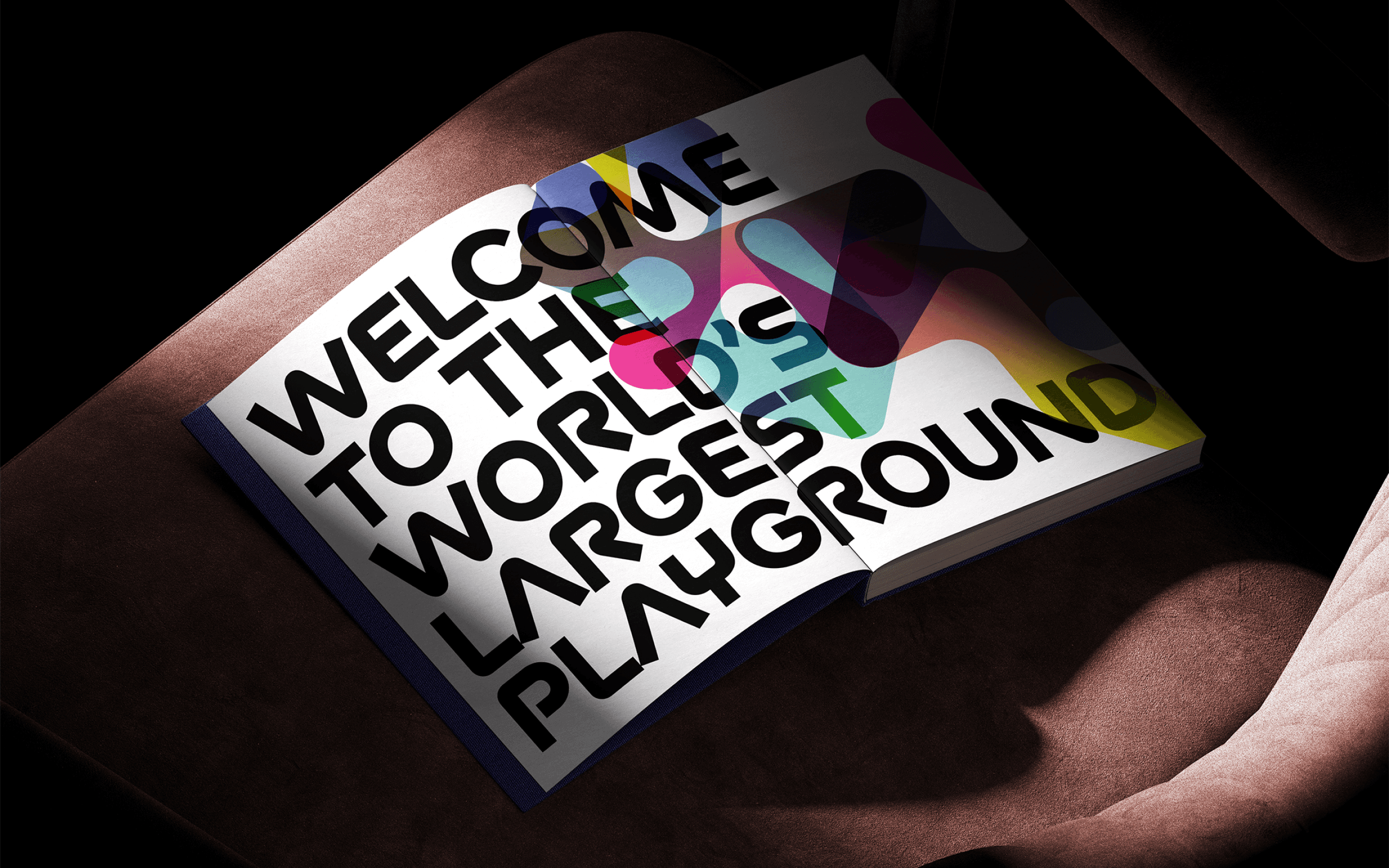
To balance the fluidity of the logomark, we designed a bespoke typeface with bold, structural forms. It grounds the identity — giving it clarity and presence everywhere from wayfinding signage to large-scale environmental graphics — so the system reads with the same confidence at any size.
To balance the fluidity of the logomark, we designed a bespoke typeface with bold, structural forms. It grounds the identity — giving it clarity and presence everywhere from wayfinding signage to large-scale environmental graphics — so the system reads with the same confidence at any size.
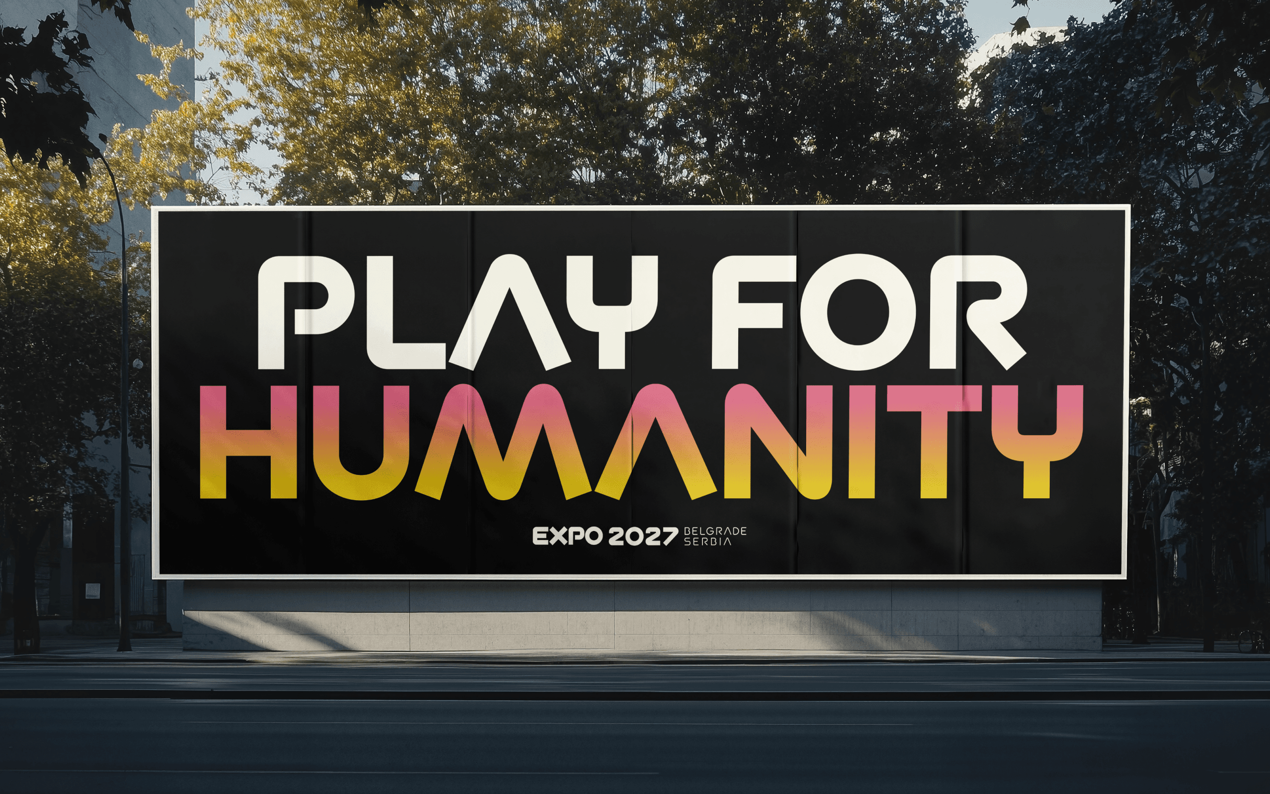
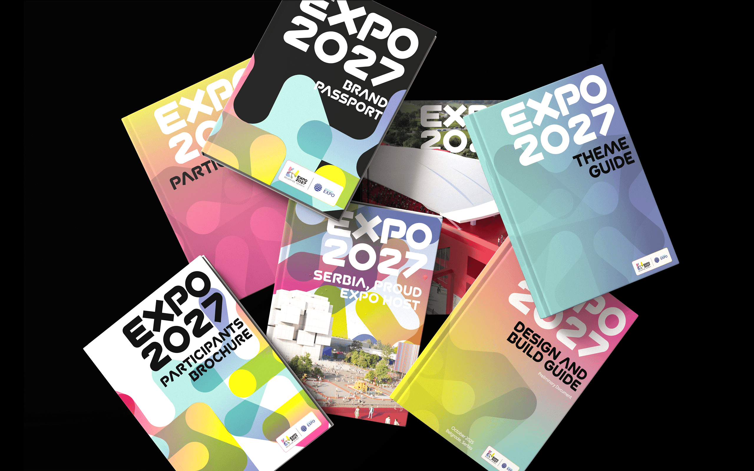
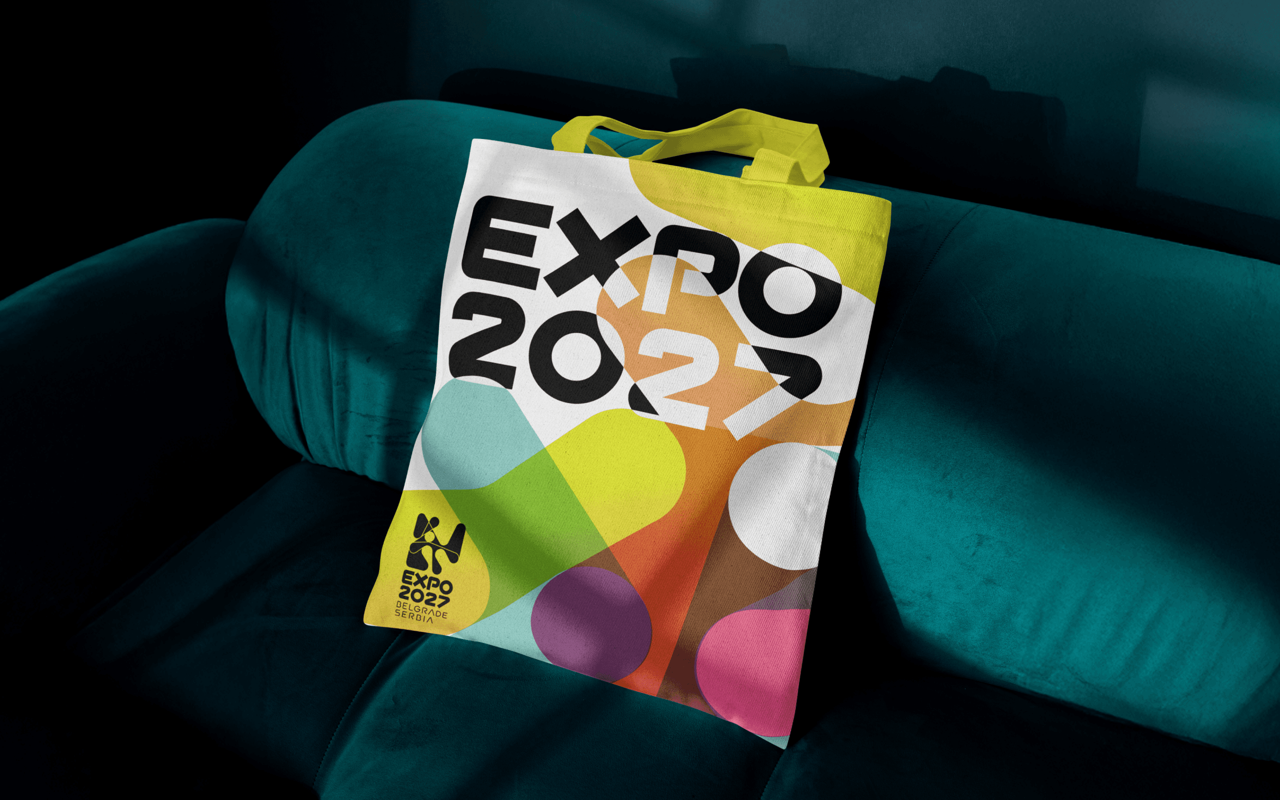
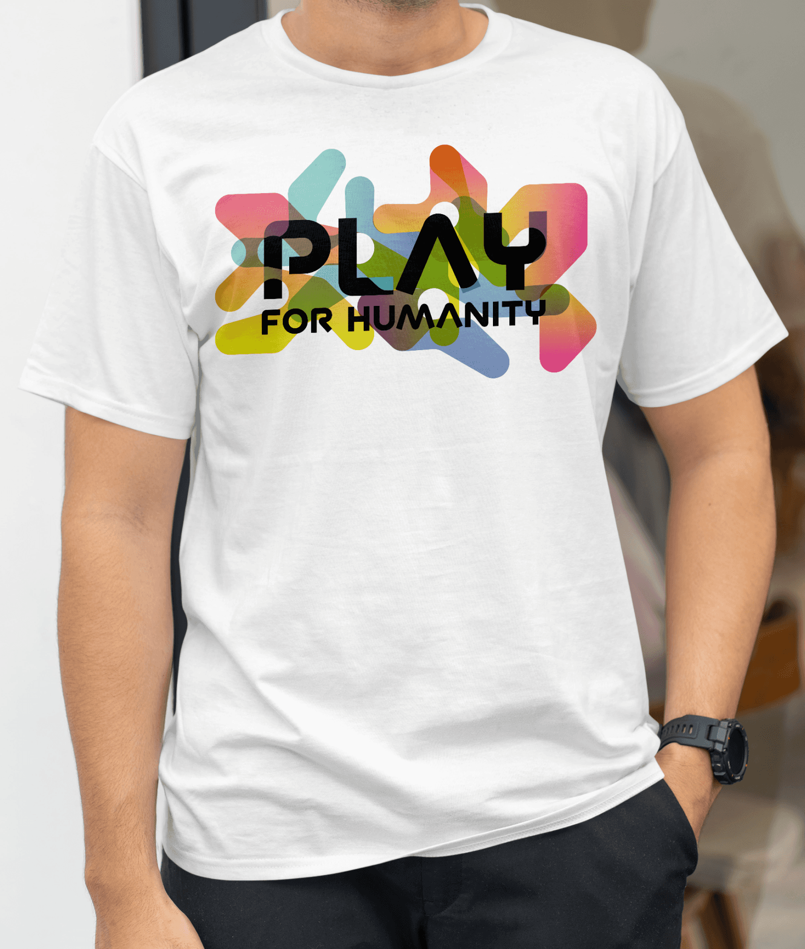
Those same forms extend beyond the logomark, becoming the basis of a flexible graphic system. Layered at different scales and transparencies, they generate an unlimited range of patterns; a single set of rules producing a brand that never repeats itself twice.
Those same forms extend beyond the logomark, becoming the basis of a flexible graphic system. Layered at different scales and transparencies, they generate an unlimited range of patterns; a single set of rules producing a brand that never repeats itself twice.
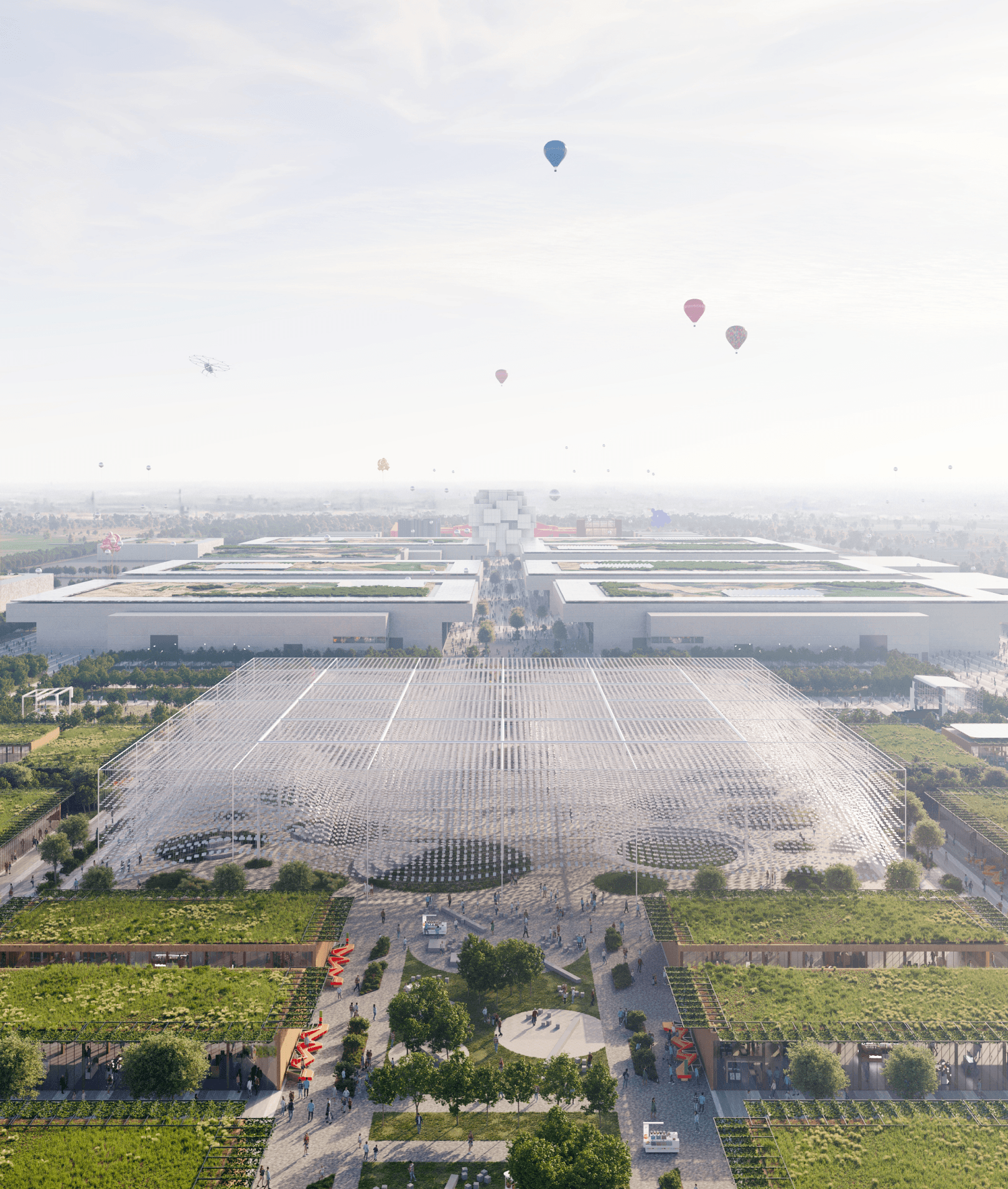
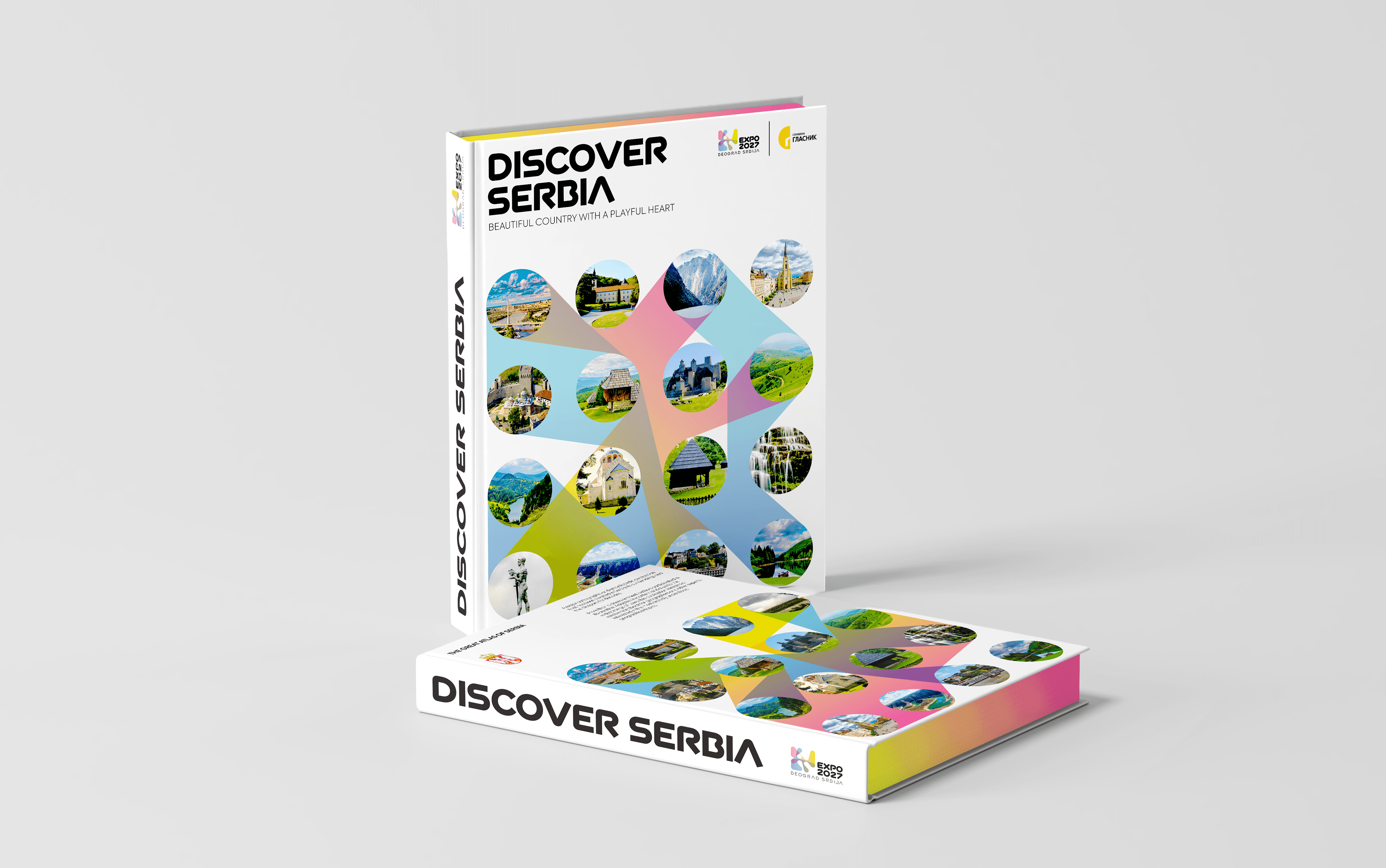
The identity's reach extends well beyond the exposition itself: aircraft livery, building façades across the campus, permanent installations like manhole covers embedded throughout Belgrade. It's this range of application, more than any single piece, that turns a design from a trend into a classic: built to still hold up decades from now, not just on opening day.
The identity's reach extends well beyond the exposition itself: aircraft livery, building façades across the campus, permanent installations like manhole covers embedded throughout Belgrade. It's this range of application, more than any single piece, that turns a design from a trend into a classic: built to still hold up decades from now, not just on opening day.