
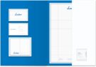
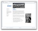
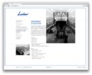
Lusben
A scripted logotype, a star and black and white photography all refer to the mid-50s when Lusben was founded and tell the tale of the brand in visual terms. The inspiration came from an old logo discovered in the company’s archives, which felt a lot like finding a precious family heirloom that everyone had forgotten about. To complete this story, the classic feel of the identity is complemented with a grid system derived from the grids used in traditional navigation and nautical maps. Visit the website here.


Other Projects

Southern Wind
